Credit Card Forms, the right way
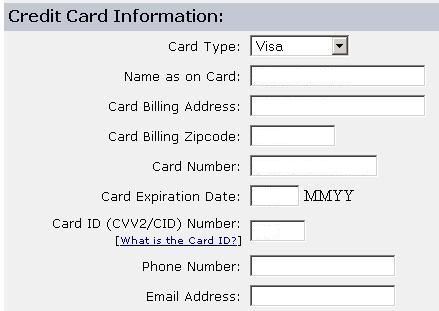
I paid a bill online today and noticed that someone FINALLY got Credit Card information right. Oddly enough, this is my rural electric company -- the LAST of my utilities to implement online billing, and generally a company that isn't tech savvy.

You will note that
The only company I have seen come close to this is yahoo stores.
Kudos ljec.

You will note that
- The form does not ask for City. It's evidently looked up by Zip code.
- The credit card number is not SPLIT INTO BLOCKS making the user wonder if tab or mouse action will be required. Same for phone number.
- The Name is one text field.
- The expiration date is requested in the form it's printing on the card. This is probably the number one problem with credit card entry forms. Cards are printed with numeric dates, not month names. This is not the place for a popup menu, it's the place for a text field. Why is this a problem? Because making the user translate the month date to a name, then select that item in a popup menu offers two additional chances for an error in entering the information. By asking the user for the data in the form that it is printed on the card, there is only one chance (which can't be reduced further).
The only company I have seen come close to this is yahoo stores.
Kudos ljec.

0 Comments:
Post a Comment
<< Home